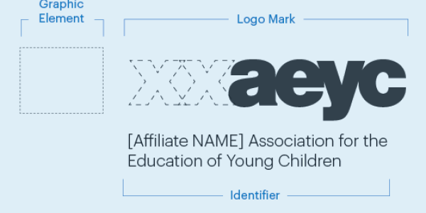
The NAEYC Affiliate brand is a visual representation of our values and beliefs.
We are:
Innovative
- Brand elements are flexible enough to allow for variation and creativity within layouts
- Brand elements are fresh and modern, using strong, vibrant colors in combination with action images
- Brand translates seamlessly across print and digital platforms
Trusted and respected
- Layouts are uncluttered, easy to follow, and have a clear message
- Titles and headlines are clear and descriptive
Reflective
- Images and messages demonstrate understanding of the topic and audience
- Charts, graphs, sidebars, pull quotes, and other graphic elements are used to enhance meaning and increase understanding
Collaborative
- Each piece includes contact information and social media links, solicits feedback, and invites participation
- Pieces include quotations and personal statements, and show diverse members, children, and educational settings
Our Personality
- Diverse
- Dynamic
- Friendly
- Imaginative
- Knowledgeable
- Open
- Professional
- Modern
The guidelines that follow are designed to provide direction and clarity in visually representing your Affiliate organization in all your communications—print and online—in line with the NAEYC brand. We request your cooperation in following these type and graphic design instructions in your internal and external materials. Please be sure your partners and vendors follow them, as well.
-
Your Affiliate Logo
Your logo is a core element of your Affiliate brand and of the collective Affiliate AEYC identity. Closely following these guidelines ensures consistency and recognition that is critical to our future success.
There are three parts to your Affiliate logo:
• Logo mark (with or without a graphic element)*
• Identifier
• NAEYC badge
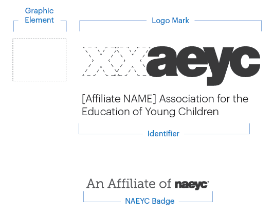
The approved logo mark format is [two-letter abbreviation]aeyc.*
Whenever possible, use your logo in full color. When you must use the logo in one color, use the one-color files provided.
*The addition of a graphic element or deviation from the approved two-letter Affiliate naming convention must be submitted and approved by NAEYC and the Affiliate Relations Committee.
Logo file types
As part of the Affiliate realignment you will receive your Affiliate logo in multiple file formats
• AI (preferred file type for printing)–The AI version of your logo is scalable to any size. Share it with vendors or other graphic professionals. Note: You must have special design software, such as Adobe Creative Suite, to open/use this file format.
• JPG (print resolution)–The quality of this file is high enough to use in most brochures, flyers, postcards, and stationery. For banners, posters, and other large-format projects, use the AI file.
• JPG (web resolution)–For use in digital projects ONLY. Note: This file has a white background; if you are using the logo on a gray or colored background, use the GIF file format.
• GIF–For use in digital projects only. This file has a transparent background.
• PNG–For use in digital projects only. This file format is best for Microsoft PowerPoint.
-
Logo Usage Guide
Unless otherwise stated, always use the logo mark with the identifier. The size of the logo mark may vary by project, but keep the logo mark and identifier large, highly visible, and legible.
Product
Logo file type
Logo mark and identifier placement
Include NAEYC badge?
Book
AI
Use the logo mark on the cover. Use the logo mark with identifier on the back cover, title page, and copyright page.
Yes, on the back cover or copyright page
Brochure
AI or print-resolution JPG
Cover and back cover
Yes
Business cards
AI or print-resolution JPG
Upper left
Yes
CD/DVD packaging
AI
Disc and back of case/packaging
Yes, on back of case/packaging
Envelopes
AI or print-resolution JPG
Upper left or back flap
No
Event program
AI or print-resolution JPG
Use the logo mark on the cover. Use the logo mark with identifier on the back cover, title page, and copyright page.
Yes
Letterhead
AI or print-resolution JPG
Upper left, top center, upper right
Yes
Newsletters, digital
GIF or JPG
Top headline and footer
Yes, in the footer
Newsletters, printed
AI or print-resolution JPG
Front page and boilerplate
Yes
Postcard
AI or print-resolution JPG
Front and back mail panel
Yes
PowerPoint slides
PNG or JPG
Cover and final slide
Yes
Signs and banners
AI or print-resolution JPG
Item determines placement
No
T-shirt, pen, and other promo items
AI
Item determines placement. Use just logo mark alone on smaller promo items. If the imprint area is so small that the logo mark would be illegible, omit the logo and typeset your organizations name.
No
Video
GIF or JPG
Use the logo mark in the intro and the logo mark and identifier in the final credits.
Yes, final credits
Website
GIF or JPG
On all pages
Yes, home page and "About us" pages.
Social Media Pages
GIF or JPG
Where possible, include logo, identifier and badge in banners, headers etc. For profile images or thumbnails, it's permissible to use just the logomark, provided the full logo is represented elsewhere on the page.
Yes
-
Using Your Logo: Dos and Don'ts
Do
Use your logo in all print, web, and digital projects. The logo mark with identifier must appear at least once.
Make sure you use the right file type for the project. See the logo usage guide above for guidance.
Be careful when placing the logo; ensure that the logo proportion are correct when scaling the image file.
Leave ample clearance space around the logo when adding it to your layouts. Don't put text or graphics within 20 pixels (px) or 0.25" of any of the logo elements.
Don't
Don’t add or remove logo elements.
Don’t add additional text to your logo, such as taglines, slogans, or mottos.
Don’t rearrange the logo elements or move the identifier.
Don't use drop shadows, blurs, feathered outlines, or other decorative elements on the logo.
Never stretch, compress, or otherwise distort the logo.
Never use reproductions (scans, photocopies, or redrawings) of your logo. Always use the logo art files provided.
Do not add a graphic element to your logo unless it has been approved as part of the Affiliate restructuring process.
-
Placing Your Logo
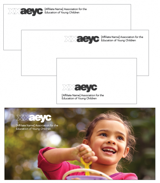
Your logo can be placed either:
• Upper left
• Centered
• Lower left
Leave a space of 0.25" or 20 pixels (px) around the logo and tagline. Don’t place text, graphics or images in this clear space.
Placing the logo mark over an image
As a general rule, avoid placing your logo mark over an image. If a project dictates this placement, keep the logo mark strong and highly visible. -

NAEYC Badge
Include the NAEYC badge on your website and member-facing materials. See the logo usage guide above for more information about which materials should include the badge.
Use the NAEYC badge art provided; don’t attempt to redraw the badge yourself.
When placing the badge, take care not to stretch or distort it in any way.
Leave a clear space around the badge. Don't put text or graphics within 10 px or 0.125" of the badge art.
Don’t add or remove elements from the badge, change the color of the badge, or otherwise alter the badge artwork.
Don’t make the badge smaller than 150 px wide on digital pieces or 2" wide on print pieces.
Place the badge in the upper right or lower left area of your design.
-
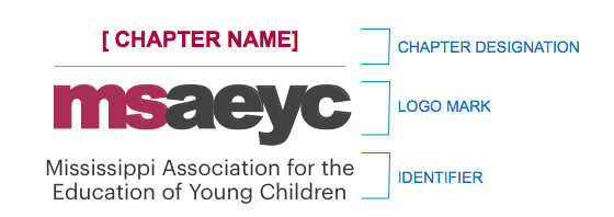

Creating Chapter Logos
Affiliates are responsible for customizing their logo for Affiliate Chapters by adding a chapter designation. Use the templates provided by NAEYC.
Chapter groups must follow the same brand guidelines as NAEYC Affiliates.
-
Brand Colors
Be thoughtful in the color story you build. Balance heavy color saturation with more minimal uses in other areas. Use contrasting colors to build energy, complementing colors to simplify your layout. Be careful not to over use color in your layouts, pair color with large areas of white space. Whenever possible, use colors at full saturation. Avoid screens of color, gradients, or fading color to white.
Tangerine:
Pantone 1665
CMYK: 0/75/100/0
RGB: 241/93/34
#F15D22
Cranberry:
Pantone 215
CMYK: 25/100/48/8
RGB: 204/13/95
#D60D5F
Green:
Pantone 348
CMYK: 97/22/100/9
RGB: 0/148/72
#009448
Charcoal:
Pantone Black 7c
CMYK: 0/0/0/90
RGB: 51/51/51
#333333
Steel blue:
Pantone 7468
CMYK: 100/45/26/0
RGB: 0/119/160
#0077A0
Sky:
Pantone 2905
CMYK: 41/8/2/0
RGB: 125/206/241
#7DCEF1
Gold:
Pantone 113
CMYK: 2/8/80/0
RGB: 255/237/70
#FFED46
-
Fonts (Print Projects)
Use these fonts in printed pieces, such as brochures, tip sheets, postcards, and posters.
Avenir
Use Avenir as the primary font in brochures, flyers, and other marketing pieces.
This font is included as part of Microsoft Office and Adobe software.
If Avenir is unavailable, Arial may be substituted.
Georgia
For print projects, Georgia is best used for text in books and other long documents and for pull quotes and headlines.
This font is included as part of Microsoft Office and Adobe software.
If Georgia is unavailable, Times may be substituted.
Museo Slab
Use Museo for headlines and pull quotes. Don’t use it for body copy or large blocks of text.
Museo Slab is included in Adobe Typekit. You can also purchase the font online at fonts.com.
If Museo Slab isn’t available, use Avenir.
Fonts (Digital Projects)
Use these fonts on your website, in emails, and in enewsletters. To use Google fonts on your website, follow these instructions. If Google fonts aren't available, use the alternate fonts listed. Don't use font effects, such as drop shadow, blur, or animation.
Lato
Use this as the main font. If Google fonts are not available, use Arial as a substitute.
Georgia
For digital projects, Georgia is best used for headlines and pull quotes.
Arvo
Use Arvo for headlines and pull quotes. Don’t use it for body copy or large blocks of text.
If Google fonts are not supported, use Georgia as a substitute.
-
Photography
Images play a vital role in shaping the NAEYC Affiliate brand. Photos can be a mix of meaningful objects, portraiture, and classroom interactions. Choose photos that have a clear focal point and are bright and crisp.
Pay close attention to the content of the image. It’s important that photos accurately portray early childhood education classrooms and scenes that demonstrate developmentally appropriate practices.
When selecting a photo,
• Avoid distracting or cluttered backgrounds
• Don’t use photos that have logos, cartoon characters, inappropriate sayings, or elements that date the photo
• Watch for overexposed images or shadows caused by camera flash
• Remember that great photos are sharp, balanced, and naturally lit
• Stay away from dark, low-contrast images
• Make sure your image isn’t blurry
For more help in selecting photographs, visit NAEYC.org/photos.

Illustration
For most applications, photography is the preferred method of imagery.
There may be times when photos are not appropriate—for example, for
• Infographics
• Digital and website elements such as banners, buttons and badges
• Diagrams, maps, or other technical pieces
• Animation
Choose illustrations that are:
• Bright, simple, and bold
• In the NAEYC colors, when possible
• Flat, with sharp, crisp lines
Avoid illustrations that are
• Overly ornate, too detailed, cluttered, or busy
• Soft, muted, or pastel in color
• Embellished or use unnecessary design effects such as drop shadow, feathering, gradients, or beveled edges
Imagery Sources
Royalty-free (RF) stock photography
RF stock photography offers a wide selection of images. RF stock photos can be purchased individually or as part of a pack or subscription.
Popular sites include
Use care when selecting images to ensure they include people from diverse backgrounds and represent developmentally appropriate practice.
Rights-managed (RM) photography
RM stock photography is the most expensive type of photography and requires careful adherence to the image contract. With RM photos, the company or individual supplying the photo retains the copyright. Image rights and cost vary depending on the contract.
Popular RM photo sites include
These sites offer both RM and RF images, so use care when sourcing images from them.
Private photography sources
Only use photos expressly provided by members, colleagues, or other individuals for your organization. Never use photos from Google images, blogs or websites, or social media unless you have permission from the photographer to do so.
If using images that show recognizable faces, you must have a signed model release from each person (or if a minor, their parent) before using the photo.
In addition to being contextually accurate, make sure the photos meet our high standard of quality.
